


5 Lessons from the Renaissance Master
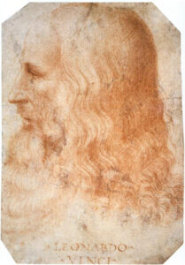
Leonardo da Vinci’s drawings were but a few of his many contributions during his lifetime.
Often touted as having been one of the greatest minds of the Renaissance, he was a renowned painter, sculptor, architect, engineer, scientist, and inventor.
(His inventions include the predecessor to the modern-day helicopter, parachute, armoured car, self-propelled cart, and many more!)
Da Vinci also studied nature, anatomy, physics, mechanics, and weaponry.
Of course, here at The Drawing Source, we are most enthralled by his drawings, in which he was masterful in far more than technical skill.
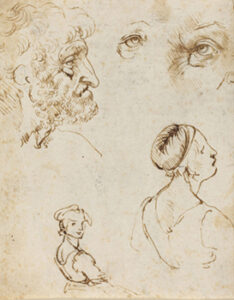
He had a gift for capturing distinct characters in his portraits.
James Beck, an art historian at Columbia University, once commented on the Mona Lisa:
“It is the inherent spirituality of the human creature that Leonardo was able to ingenuine to the picture that raises the human figure to some kind of majesty.”
Perhaps that is why we are still in awe of Leonardo da Vinci’s drawings 500 years after their creation.
He was a master of simplification.
This does not mean that his drawings were simple! Just the opposite.
Simplifying can ironically be one of the most difficult aspects of drawing.
To simplify, an artist must know what information is essential to include in their drawing, and what to leave out in order to strengthen it.
Leonardo da Vinci’s drawings are a perfect example of this. He was very selective, and there is nothing excess or unnecessary in his drawings.
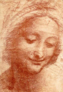
or example, look how simply the shadow shape on the neck is drawn.
There are only a few delicate value shifts to indicate the subtle turn of the form, and the separation between the head and neck.
If more detail had been included in the shadow, it would attract our attention and distract us from the focal point of the image: the face.
Lesson #1:
Perhaps during our next drawing session, instead of wondering what to include, we can ask ourselves: What should I leave out of my drawing?
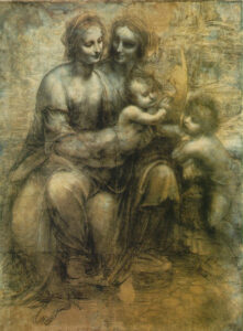
Leonardo used dark values and sharp lines sparingly.
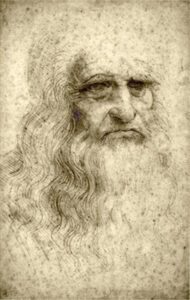
Many Leonardo da Vinci portrait drawings are mid-range (or middle key) on the value scale.
This means that he drew mostly with values 3 to 7, using the extremes (pure white and pitch black) only as carefully considered accents.
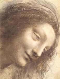
(Granted, we do not know how much darker these drawings may have been original.
They must have faded considerably over the past 500 years or so!)
But even if this was not the intended effect, look at the dream-like quality that it creates in this and the next Leonardo portrait drawing. The images almost look like memories. Why not consider using this effect in your drawings?
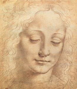
Da Vinci was also very selective when using sharp lines. For example, in the drawing above he used dark, sharp lines only to accent and bring depth to the features of the face (the eyes, nose, and mouth). Especially because these accents contrast the softness of the rest of the drawing, they effectively bring our attention to the focal points: the features of the face.
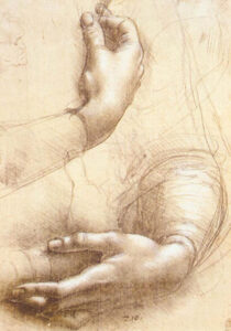
There is a sense of movement in Leonardo da Vinci’s drawings.
Even his drawings of models in stationary poses feel organic and lively!
One of the reasons for this is the gestural quality of his lines.
We can often see remnants of gesture lines with which he began his drawings.
They seamlessly become a part of the final image, adding dynamic movement and interesting compositional elements to the picture.
They also provide a kind of glimpse into Da Vinci’s thought process.
We can almost see him searching for rhythms and forms as he pulls them out of the paper.
What we can learn: Often the longer and more detailed our drawings are, the greater the tendency for them to stiffen up and become static.
We can remedy this by paying attention to gestures and rhythms throughout our drawing. Furthermore, if we exaggerate the gesture slightly in the beginning, then even when we “tighten up” our drawings as we add more detail, the image will retain some of that original movement.
Speaking of exaggeration…
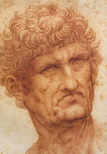
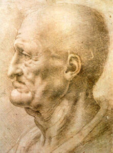
Da Vinci used exaggeration to add character to his drawings.
Not all of his subjects are drawn naturalistically (how they would appear in life).
Perhaps because of the way he exaggerated certain qualities of the portraits, it looks as if some of his subjects existed somewhere between dreams and reality.
However, this slight caricaturization adds a great deal of character to the drawing.
I am reminded of a quote by Russian portraitist Valentin Serov, who once said:
Any human face is so complex and so unique that you can always find in it various traits that are worth portraying, be they good or bad.”
He continued, “For my part, each time I appraise a persons face, I am inspired, you might even say carried away, not by his or her outer aspect, which is often trivial, but by the characterization it can be given on canvas.”
“That is why I am accused sometimes of having my portraits look like caricatures.
I see this quality in Leonardo da Vinci’s drawings as well and very much enjoy it.
Perhaps during our next drawing session, we can ask ourselves: What can I slightly exaggerate in order to enhance the character of my drawing?
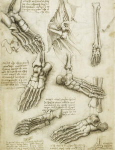
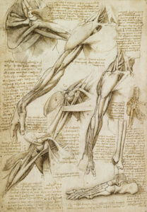
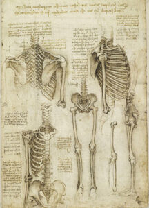
Leonardo constantly drew studies.
He recorded his observations and inventions in 13,000 pages of drawings and notes! Looking at these sketches, you can see his incredible desire to truly understand what he was looking at and drawing. The next time we are about to jump into a new drawing, perhaps it would benefit us to first draw a few studies of our own!
thedrawingsource.com
